_By Harry H. Hamilton_
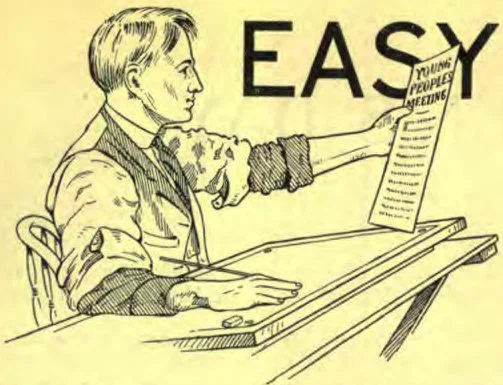
Have you not had occasion to write in printing on paper or blackboard, and wished that you were able to print such matter neatly, making it artistically attractive? Many persons have expressed such a desire to the writer of this article. It is with a view to helping young people who will persistently practice, that this series of lessons is offered in the INSTRUCTOR.
It is well to mention just here that faithful practice will bring the reward; but a person cannot by merely reading over these lessons and admiring the plates of letters, expect his enthusiasm, minus persistent practice, to make him master of this useful art.
The lessons will be made simple, and but few styles of letters will be introduced, as it will be more profitable to master two or three styles of letters, than to perfunctorily exploit a great number of alphabets.
Materials Required
In the work of this series but few materials are required, and their cost will not exceed $1.50. A No. 4 Esterbrook’s Text Writer Pen, Nos. 5H, 2B, and 4B lead pencils, chalk crayons, marking and shading pens, and a flat brush. White Bristol board with smooth surface is used for pen lettering. For practice work penmanship paper may be used. The most satisfactory ink is Chinese or Japanese ink sticks, which are put in solution on an inkstone or slab. Water is placed on the slab and the stick of ink is rubbed to solution on the surface of the slab. An inkstone usually costs about thirty-five cents, the stick of ink from five to thirty-five cents. A slab with a shallow well about three sixteenths of an inch deep is ideal. This material may be procured from novelty and art houses or from dealers in Oriental wares.
How to Hold and Dip Pen
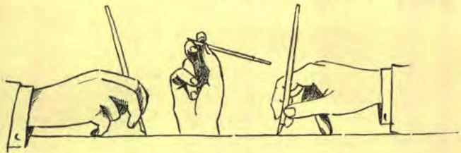
The pen should be held in a nearly vertical position; the broad, flat point should be at an angle of forty-five degrees with the line of writing, as shown by the drawings of the pen point, in the plate. This is the position of the pen whether for the text writer or shading pens, and for all letters whose extremities show that they are made with this slant. The position of the point is always at a slant of forty-five degrees.
While one of the best methods for holding the pen is that shown in the drawing, there are persons who find it difficult to hold the third finger against the palm of the hand, or even back of the little finger. This method is good because text lettering is done by finger motion, and when the third finger is removed from the path of the second in its upward and downward sweep, there is much greater freedom of action than could otherwise be had.
The pen must not be dipped deeper than about one eighth of an inch. If the eye of the pen be filled, the ink will flow off at the first touch and blot. Shallow dipping gives the best results, and it will be necessary to dip the pen several times for some of the letters.
Directions for Making Letters
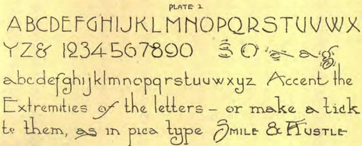
For Plate I, rule with a No. 5H pencil two faint parallel lines one-eighth inch apart. Use a straight-edge, and make the guide lines so light that they will not be noticeable when the letters which you are to make with a No. 2B pencil are written between the lines.
The method of the stroke in lettering with pen or pencil is the same as that of using a brush. A brush will not write upward when held properly. This alphabet is the foundation of all the plates to follow. Notice that the extremities of the letters are accented slightly. Though your letters in your first efforts may not be expertly made, yet your lines will appear well if the letters be evenly spaced and all their stems vertical.
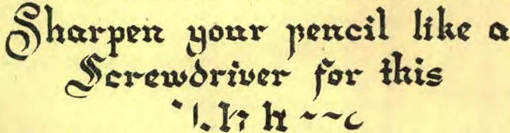
The broad letters are made with a No. 4B pencil sharpened to a flat point like a screw driver. The dim guide lines are one-fourth inch apart for the small letters.