When drawing from nature, one of the chief qualities to be avoided in pen-and-ink work is “fussiness,”—putting in little lines that detract from the picture.
One difficulty the student will have will be in discovering which are the most important lines; but by making a careful preliminary drawing and studying what must be retained, and what can be left out without detracting from the general effect, he can determine which lines must be retained. The important things should be clearly noted with the pen; the rest should be erased, leaving nothing but black lines and white paper, which will reproduce perfectly.
In the drawing of trees, mannerisms should be avoided; and the only system to follow must be that which each student invents for himself by studying nature. Analyze everything in nature, and ascertain what lines will best give the character of form, texture, and quality of each object. Remember to mass your shades, especially in trees, no matter what technique is used. Hardly two artists use the same technique in drawing trees or other objects, yet one will observe that the shades in all drawing are massed in nearly the same manner.
After the pencil outline has been drawn, the color-tones and shadows can be indicated very lightly with a softer pencil in the parts to which they belong; then the student can see what shades can possibly be left out. In general this will be whatever does not give character to the object.
In using the term “color-tones,” I mean the varying degrees of light and dark, and am not speaking of the colors as colors,—red, blue, green, etc. In pen-work the artist is unable to indicate the colors of an object; but of the strength of value of one color, as compared with the colors around it, he should be able to give a fair understanding.
Never work at a picture when tired, or when not in the mood to draw; for if you do, your work will show it. Never work laboriously upon a drawing in the hope of remedying an error already made. It is better, when completely dissatisfied with one’s work, to begin it afresh. “Not failure, but low aim, is crime.”
The border, if the drawing requires one, should be as heavy as any other line in the picture, if not heavier. This will set the picture off, while a lighter line will not. A picture with heavy lines or dark shades will look best with a dark border.
A picture is finished when you are doubtful if any additional work will improve it. Sometimes beginners, in studying the work of artists, see very little in their pictures to admire, especially in pen-work, which contains broad strokes, seems to have been carelessly drawn, and appears to them only partly finished. But the student will do well to follow this style of drawing; for he should remember that these artists have made a study of their work, perhaps devoting a lifetime of constant study to attaining the perfection they have reached. The student will, when sooner or later, if he continues to study art, come to this conclusion, and will regret that he wasted his time in following the taste and advice of those who were not masters of the art.
If the student has a turn of mind toward decorative art, he will find much help in studying nature. The same rules in drawing for reproduction apply to decorative art for publication; that is, the lines should be open and clear. Book plates, initials, chapter-headings, tail-pieces, posters, decorative panels, etc., all come under the head of “decorative art.” More detail is sometimes put into this class of work than the other. Nature must be the foundation of this work; for plant and flower forms, mostly conventionalized, are used in nearly all decorative work.
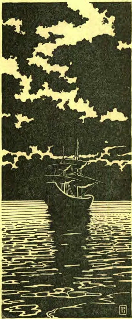
For poster work, and drawings like the accompanying panel, the student will find the shadow drawing, explained in a previous article, of great help to him.
A few words as to the signature on a drawing. Some artists sign their full names, others simply a monogram, and others their initials. Any of these ways is good; but don’t scatter your name clear across the drawing, nor sign it in a way which is no more legible than a puzzle. Make a neat, clear signature. A signature is put to a picture so that any one who wishes to know404who the artist is, can find out by reading the artist’s name. It should not be so plain that it is the first thing that attracts the eye, and in a way detracts from the picture; neither should it be so constructed that no one but the artist himself can decipher it.
In making pen-drawings for reproduction, the greatest difficulties will be avoided if the student will carefully attend to the following suggestions:—
First of all, study nature.
Study good examples of pen-work.
Draw from memory.
Make careful outlines.
Draw only what impresses you.
Mass and simplify your shades and shadows.
Be individual in your choice of subjects.
Represent objects with as few lines as possible.
Do not fill your work with little scribbled lines.